First Choice
App Overview
The application was a core part of the project as the organization decided that all communication with the customer would be done through the First Choice App. This would include a live chat system that could provide excellent customer service.
While at the same time, the app would have built-in features that would automate the system for many clients.
The users will be able to create accounts which would assist and maintain all the information. This would include licenses and registration details along with the essential information as per services.


Design Process
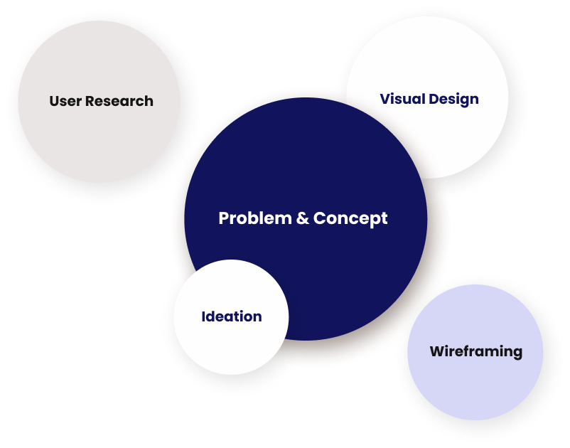
The Design Process was the crucial part as the design team sat together to recognize the problem. At the same time, the design was also created to make the concept of the company easy to understand. Once the general overview of the idea was designed, the team started creating a color template and typography that would visually be appealing.
Once the visual design was complete, the team began working with the client to create a wireframe that was to be followed. The application and the website had to be designed in a manner which provided the users with an easy-to-follow interface.
Combined with user research and popular trends, the design process was completed to provide the client with a final look.
Project Timeline
The project timeline was designed by splitting it into two core parts. The first consisted of UX Research, while the other consisted of UI Design.
The table below shows the planning breakdown and the timeline that was followed.
.

Wire Frame
The wireframe was created as a way to simplify complex tasks for the targeted user. It involved designing each screen that would be
shown the user's journey from the initiation of the application to the completion of intended use.

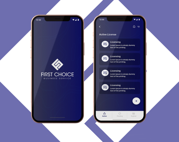
The First Choice Application
The application was important as it was the primary platform between the client and the user. Once the wireframe was finalized, the
application was revamped and finalized accordingly.

First Choice Website
The intention of the website was to provide similar services to the application as a way to expand the horizon of user reach. The website was created to provide maximum reach and be a way for the user to access the same services and data on the web as well as the application.

Fundamentals of Design
The fundamentals of design were planned to ensure that the users had a good and clear interface to work with. As the user would be spending a good amount of time answering targeted questions, the color scheme had to be light on the eye, while the text had to be clear and understandable.


